Not All Dashboards are Effective
An optimized digital experience encompasses many elements, but accurate and reliable data is a foundational component. Creating a positive impact for a business and its customers requires accessible, exact, and timely data that anyone can understand at a glance.
Dashboards are a collection of data points put together in a way that’s generally more accessible to a wide array of audiences and lets them see data quickly. Effective dashboards can help companies better understand their data and uncover insights to improve their online presence. However, not all dashboards are instantly useful or clear. Dashboards created without proper thought and effort can create more questions and distrust in the data, which limits insights. To be useful a dashboard must provide accurate and valuable information to key stakeholders.
Dashboards created without proper thought and effort can create more questions and distrust in the data, which ultimately limits the insights you can gain.
There are three key themes that will help ensure your dashboards are as effective as possible: consistency, readability, and reliability. In our dashboard methodology series, we’ll dive deep into each theme, one article at a time. In this article, we’ll discuss consistency. Keep reading to learn more.
Build with Consistency
Consistency goes a long way in providing data points that help connect the dots across all stakeholders and team members. When a dashboard prioritizes consistency, it doesn’t matter who’s viewing the dashboard or whether they’re viewing it for the first time or the tenth time: the individual viewing the data is seeing the same data presented in the same way. This practice eliminates inconsistencies in the data. Some ways to help maintain consistency in your dashboards are:
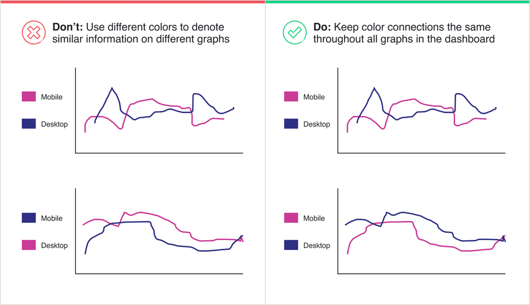
- Using the same colors to denote the same things
- Using the same terminology across all data points presented
- Using the same overall organization, look, and feel across all of your company’s dashboards
Use Colors Consistently Within and Across Charts
Using the same colors to denote the same meanings helps ensure the connections between data points stand out — both within the same charts and across charts with similar data points. Examples include using red for all negative changes and green for all positive changes, or consistently using pink to represent mobile in charts that call out mobile data points. If pink means mobile and purple means desktop for graph A, then in graph B, pink means desktop but purple means mobile, a stakeholder could incorrectly associate the orange data points in graph B with mobile rather than desktop. When a user experiences consistency in what each color represents, it allows them to remember the data points faster and leaves less chance of user error when digesting the information.
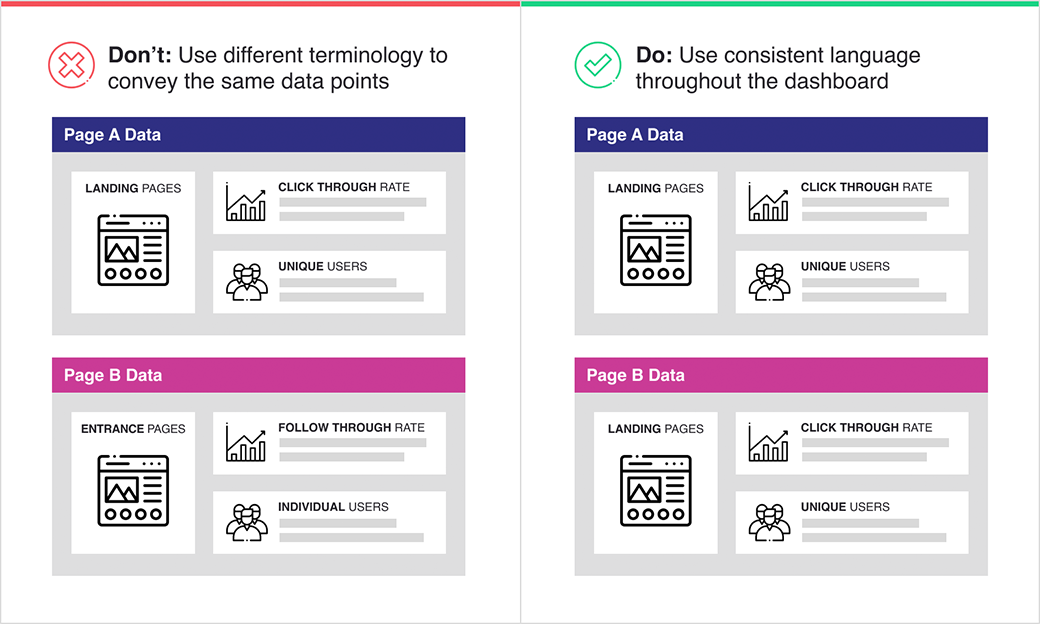
Keep Your Terminology Consistent and Opt for Simplified Language
Using the same terminology across data points is also very helpful in letting users make quick connections and eliminating room for user error. If you use term “X” in one chart and term “Y” in another chart, but both terms refer to the same metric type, it may be difficult for the stakeholder to understand that they’re the same metric type. Adding layers of uncertainty will potentially lead them to misinterpret the data. If a similar pattern of inconsistency persists throughout the entire dashboard, the stakeholder will question the trustworthiness of the data altogether.
Quick adjustments to the language and terminology of your dashboards can go a long way toward improving data literacy within an organization.
Additionally, remove technical jargon from the dashboard and replace it with simplified common language when possible. Doing this will help stakeholders to understand the data correctly and quickly, with less room for misinterpretation. For example, replace GA Universal’s event category, action, and label with terms representing what the values mean. Likewise, if the event centers on the number of clicks to a particular link or button, instead of using the out-of-the-box term “total events,” say “total clicks” instead. These quick text adjustments can go a long way toward improving data literacy within an organization.
Establish a Consistent Look and Feel
When creating multiple dashboards over time, use the same general look and feel for each dashboard to help stakeholders find the desired information faster. When each dashboard comes to life using the same color schemes, icons, and organization/themes, stakeholders know what to expect when viewing a new dashboard for the first time and can more intuitively read and understand the presented data. Additionally, maintaining the same look and feel, and even going a step further to add company logos and brand colors, will provide excellent quality and a clean look with a tailored feel.
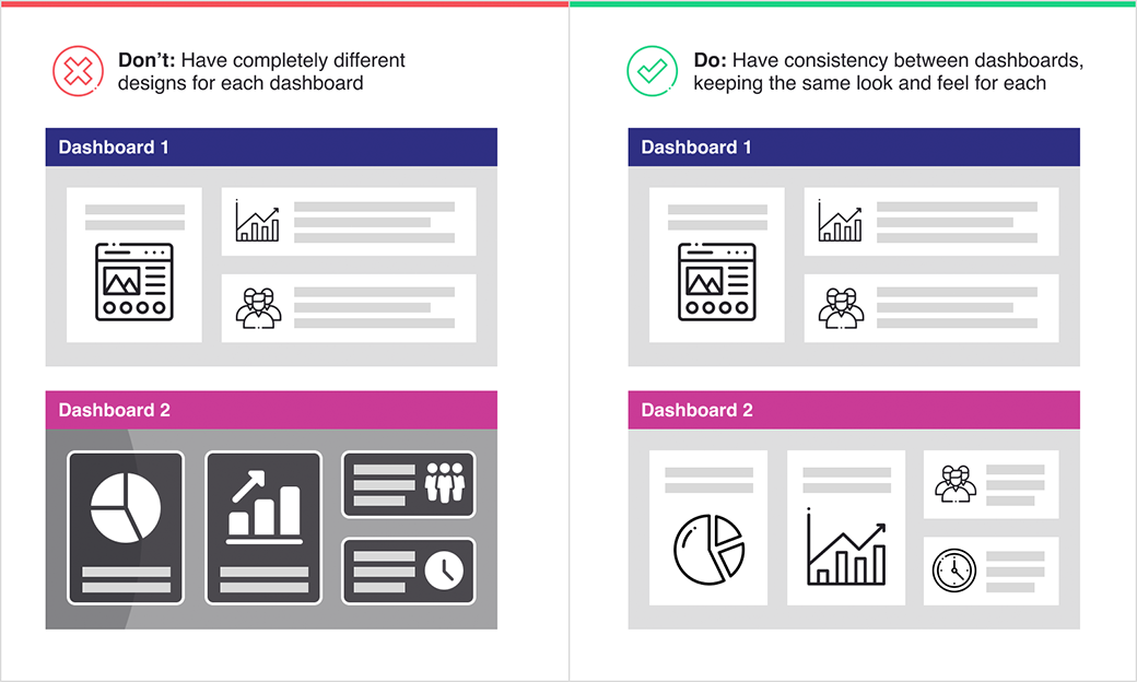
Dashboards not built with consistency in mind quickly lead to more questions and demand more of the user’s time to understand the data presented. Taking the time upfront to ensure consistency across the dashboards you build will save you from countless headaches and rework in the future.
Building Effective Dashboards
While dashboards should remain up to date as an organization’s data needs and collection methods change, they need to be as effective as possible at any given time. Building effective dashboards means taking the time to ensure the dashboard delivers consistency, can be easily digested by the stakeholder, and is a reliable source for making data-driven decisions within the organization. Have you built a dashboard recently, or do you already have a few dashboards used across your organization? Revisit them and double-check that they’re consistent, readable, and reliable for every audience. Need a second pair of eyes on your dashboards or want to make them more effective? Reach out to BlastX for support.