When I’m not deep in analytics, you’ll often find me behind a camera. Photographing vast landscapes and capturing close-up wildlife requires completely different lenses. A wide-angle reveals the full scene, while a long zoom brings distant details into focus. Use the wrong lens for the job, and you won’t get the results you want. It’s easy to blame the camera, but the real issue is expecting the wrong results from the wrong tool.
Dashboards work the same way. Many are built with unrealistic expectations, and when they fail to deliver insights, we blame the dashboard instead of our approach to insight generation. The truth is that dashboards aren’t useless—they just aren’t designed to uncover the deeper patterns and context that turn raw data into actionable insights. In this article, we’ll explore why that happens and how to create a system that consistently generates meaningful business intelligence.
Why the Perfect Dashboard Will Never Deliver True Insight Generation
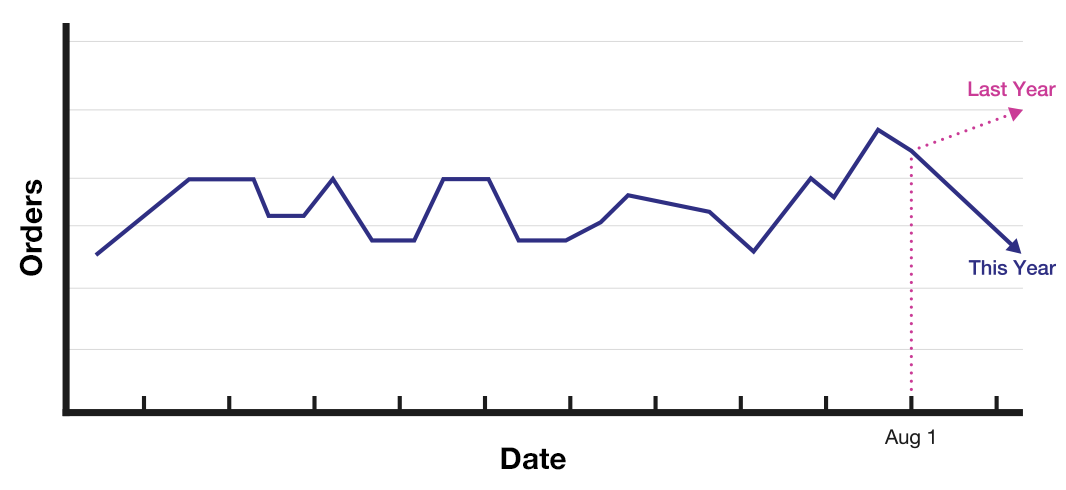
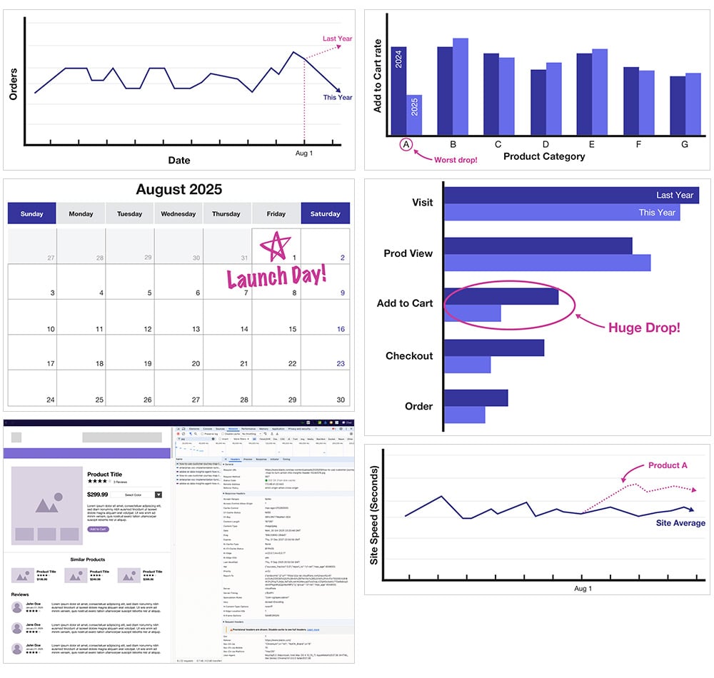
Let’s walk through a scenario I’ve seen play out countless times. You’re reviewing your monthly performance dashboard and notice something troubling: orders are down 15 percent compared to last month.
Is this an insight? Not quite. It’s simply an observation.
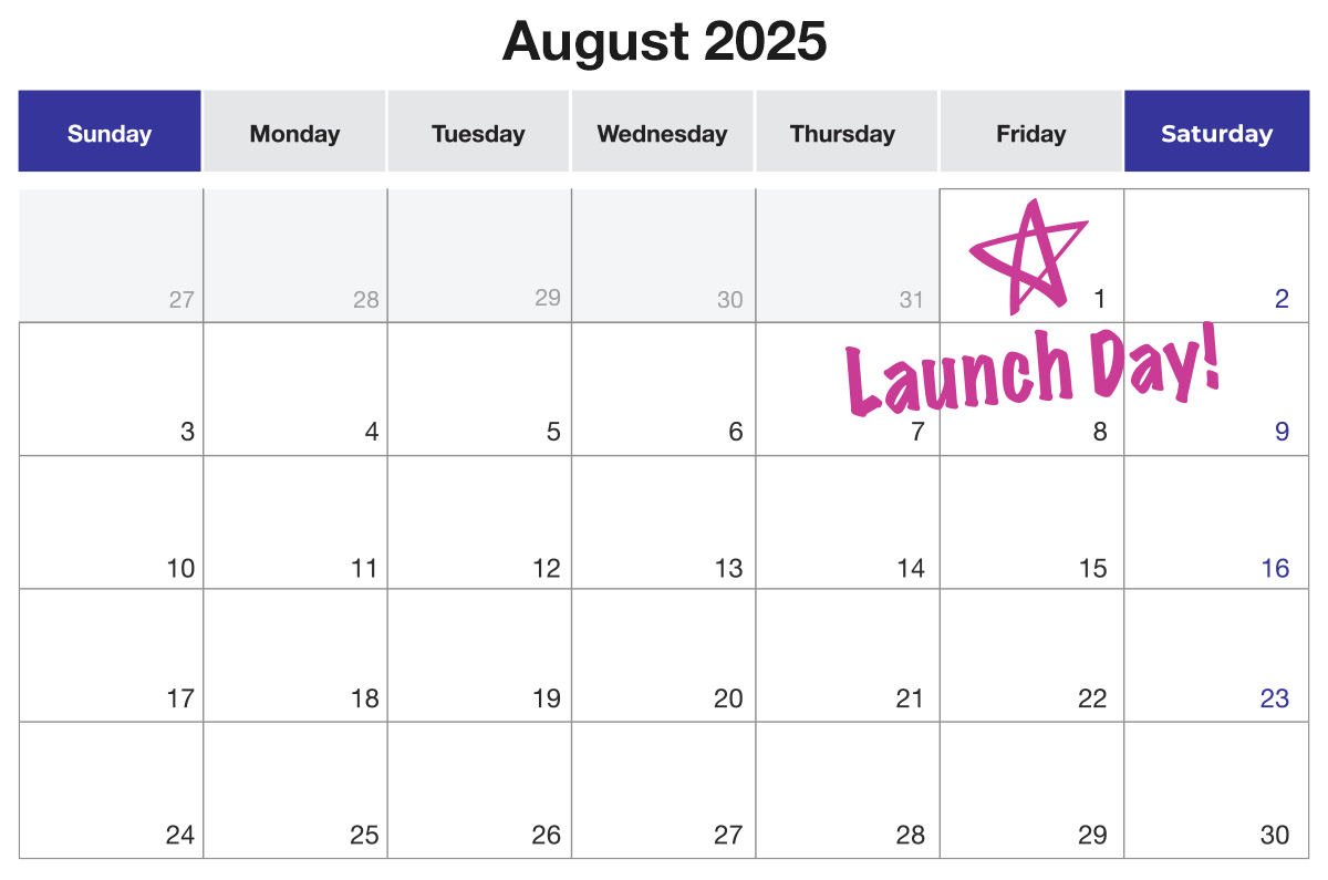
You dig deeper and recall that on the first of the month, your team launched a new website redesign. Now, you’re starting to connect dots that could be related.
Still, this isn’t an insight yet.
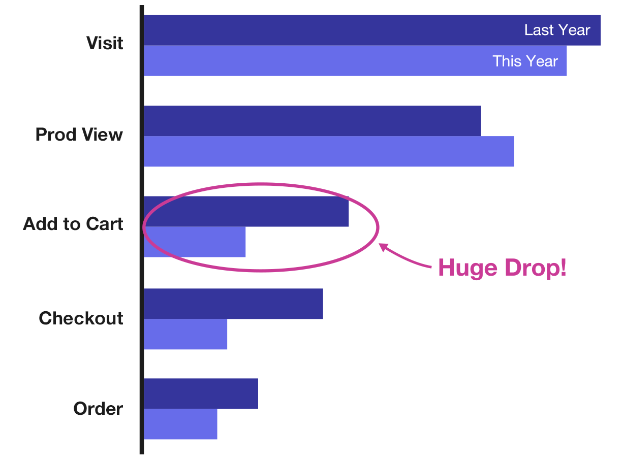
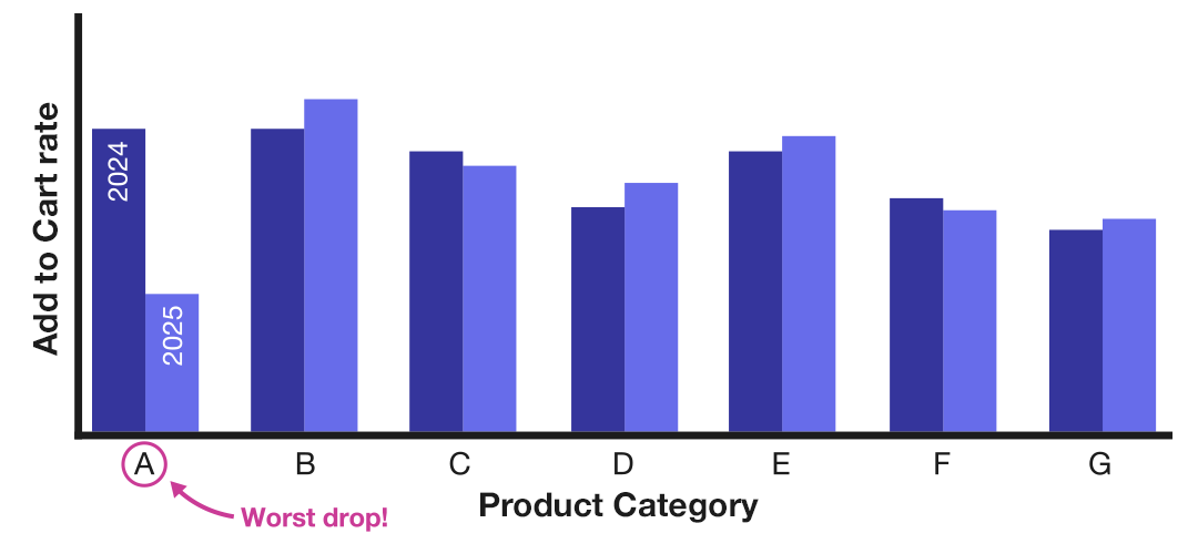
Further analysis shows that the drop in orders is driven by a 25 percent decrease in add-to-cart rate after the redesign. More specifically, this decline affects only one product category—let’s call it Type A. The rest of your products are performing normally.
Getting closer, right? But there’s still more to uncover.
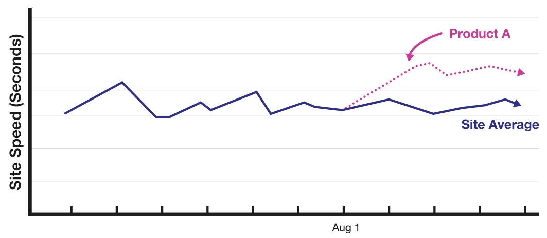
A deeper look reveals that overall site load times are unchanged, but Category A product pages have slowed by an average of two seconds. The cause? Product images for Category A items weren’t optimized for mobile in the redesign. However, this fact was not immediately obvious by just using the data in my analytics tool. I also needed to actually visit the website and actually load the pages and do some digging in the network tab.
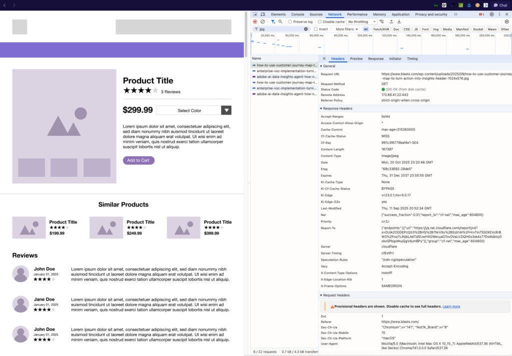
So while a line chart showing very clearly that page load speeds are slower for product A pages when compared to the rest of the site, just one chart only shows part of the story.
Now, we have enough connections to call this a true insight:
“Conversions dropped 15 percent this month because mobile site speed increased by two seconds for product detail pages of a popular product type, caused by unoptimized images in our recent redesign.”
That’s insight generation—a shift in understanding that reveals critical patterns and, when applied in the right context, drives meaningful business change. And here’s the key takeaway: no dashboard, no matter how well-designed, could have delivered this automatically. And if it did, it would be tailor-made, and have no value for any other purpose. One such dashboard might look like the one below:
What Makes Insight Generation Possible
True insight generation requires two essential ingredients working together.
First: meaningful patterns or anomalies. Psychologist Gary Klein identifies four key types:
- Connections – spotting relationships between pieces of information that once seemed unrelated.
- Contradictions – finding inconsistencies between what’s expected and what’s actually happening.
- Coincidences – noticing unexpected alignments or correlations between events.
- Curiosities – identifying anomalies that don’t fit existing expectations.
Second: the right context. Context can come from many sources—filters, segments, targets, dimensional breakdowns, correlated metrics, date ranges, external data points, or historical experience. And here’s the challenge: dashboards alone can’t deliver actionable insights because context is infinitely flexible. For a dashboard to generate the perfect insight every time, you’d need to know in advance exactly which segments, filters, date ranges, dimensions, metrics, and visualizations will matter—before any event even happens.
That’s like trying to hit a bullseye on a target that hasn’t been built yet.
Right Tool for the Right Job in Insight Generation
So, are dashboards obsolete? Absolutely not. They remain a critical part of an effective insight generation process—but only when used for the role they were designed to play.
Think about three different tools: binoculars, a magnifying glass, and a microscope. They all magnify, but each serves a distinct purpose. You wouldn’t use binoculars when you need a microscope, or a magnifying glass when you need binoculars. If you did, you’d likely blame the tool for poor results, when the real problem is choosing the wrong tool for the job.
In a well-structured insight generation system:
- Dashboards are your binoculars. They scan the horizon, helping you spot changes from a big-picture perspective. They’re perfect for monitoring performance trends but not for explaining why something is happening.
- Narrative reports are your magnifying glass. They add context, follow your investigation, and highlight areas that deserve deeper analysis.
- Analysis is your microscope. This is where you zoom in on high-priority anomalies or hypotheses, uncovering the root causes that lead to actionable insights.
Just like a lifeless body in a murder mystery, a dashboard will sit there, full of information, yet remain silent, offering no explanations, no insights, and certainly no tales—unless someone steps in to find and interpret the data.
When you use each tool for its intended purpose, you stop expecting dashboards to magically deliver answers and instead create a streamlined system that moves from observation to investigation to insight. This layered approach transforms raw data into decisions that actually drive business outcomes.
Building Your Insight Generation System
So, how do these three tools — dashboards, narrative reports, and analysis — work together to systematically deliver actionable insights?
Step 1: Dashboards — your binoculars
Dashboards provide a high vantage point, allowing you to scan performance trends such as a dip in conversions, a spike in traffic, or a sudden drop in add-to-cart rate. Their role in insight generation is not to explain why something happened but to flag where you should look next.
To make dashboards effective:
Start with clear reporting requirements, framed as user stories:
“As a [role], I need to monitor [metric/KPI] in order to [decision/action] at a cadence of [frequency], so that I can [business outcome]. I will know it is working when [specific signal or threshold].”
Set explicit targets so you can answer “Is this good?” at a glance.
Include first place to look breakdowns — your go-to first-layer views when something looks off. Avoid overloading dashboards with every possible metric “just in case.”
Think of dashboards as performance scoreboards: clear, concise, and updated consistently.
Step 2: Narrative reports — your magnifying glass
When a dashboard flags something unusual, a narrative report adds the first layer of context. It explains what might be driving the change, surfaces quick answers, and identifies where deeper investigation is required.
This is where external context becomes essential: recent marketing campaigns, competitive activity, seasonal patterns, or even weather events. Maintain a consistent cadence (weekly, monthly, etc.), and if the answer is not clear in a couple of minutes, log it as a question or hypothesis for further analysis.
AI can serve as a valuable co-pilot here, drafting observations, flagging anomalies, and suggesting next steps so you can focus on validating and applying human judgment.
Step 2.5: Capture opportunities with an intake form
Between narrative reports and deep-dive analysis, you need a structured way to collect the observations, questions, and hypotheses that might be worth pursuing. Without it, potential insights can disappear into emails or hallway conversations.
Your intake form should be lightweight yet structured, with fields for:
- Submitter name and date – to enable follow-up.
- Type of entry – Observation, Question, or Hypothesis.
- Brief description – one or two sentences summarizing the idea.
- Supporting data – links to dashboards, reports, or external sources.
Store these entries in a centralized repository such as Airtable, Google Sheets, or your project management tool, where analysts can prioritize them based on potential impact, required effort, and alignment with business goals.
This intake process transforms offhand comments and casual “What if?” ideas into a steady pipeline of potential insights.
Step 3: Analysis — your microscope
By the time a question reaches this stage, it has been vetted and prioritized. Analysts now have a clear hypothesis, relevant context, and well-defined questions. This is where deep analysis happens, running experiments, identifying statistical relationships, and uncovering root causes.
The outputs from analysis should be actionable and measurable, such as:
- Confirmed business drivers
- Optimized customer experiences
- Measurable revenue gains
But analysis only creates value when it is fed back into the system. Close the loop by:
- Tracking actions taken based on recommendations.
- Monitoring results with existing or new dashboards.
- Measuring the business impact — ideally in revenue, but at minimum against key metrics — and logging it in the intake form.
This feedback loop proves the ROI of your analytics program, justifies future investment, and strengthens your overall insight generation system.
How to Make Insight Generation a Repeatable Business Advantage
When dashboards, narrative reports, and analysis work together, insights do not happen by accident. They happen by design through a deliberate insight generation process.
To recap, here is the systematic approach:
- Stop expecting dashboards to deliver complete insights. Redefine them as performance scoreboards—tools that monitor what is happening, not why it is happening.
- Remember that insights require both patterns and context. This is why no static dashboard can reliably generate actionable insights on its own.
- Adopt a layered insight generation system. Move from dashboards (binoculars) to narrative reports (magnifying glass) to analysis (microscope). Each stage feeds the next, creating a path from observation to business action.
- Create an intake and prioritization framework. Capture every anomaly, question, or hypothesis in a central repository so promising leads are never lost.
- Close the loop with measurable business impact. Track what actions were taken, measure their results, and log the outcomes. Tie recommendations directly to revenue or key metrics to prove ROI and secure future investment.
The goal is not to eliminate dashboards. It is to use them correctly within a system that surfaces anomalies relevant to your business, adds context, and develops those findings into actionable insights that drive measurable results.
When you stop asking dashboards to do the impossible and start building a system that supports true insight generation, data-driven decision making becomes not just possible but inevitable.
Ready to turn your data into a repeatable engine for insight generation and measurable growth? BlastX Consulting helps organizations move beyond dashboard dependency to design analytics systems that surface the right patterns, add the right context, and deliver actionable insights that drive real business outcomes. Let’s create experiences that inspire and impact that lasts — connect with our team today to start building your insight generation system.