Accurate and reliable digital analytics dashboards are an excellent initial foundation for utilization and data visualization, but improving readability makes your dashboards more accessible and digestible for all. Once you have a sound dashboard in place, it’s imperative that all stakeholders can easily read it and end up on the same page of understanding. Obtuse and inefficient dashboards can quickly invalidate your prior work, so make sure to address the key finishing touches we’ll discuss in this conclusion to our three-part dashboard series.
If a dashboard design isn’t easy to understand, it won’t help stakeholders understand the data and how they can use it. A readable dashboard is critical to creating positive data-driven changes. Three elements to ensure dashboard readability include:
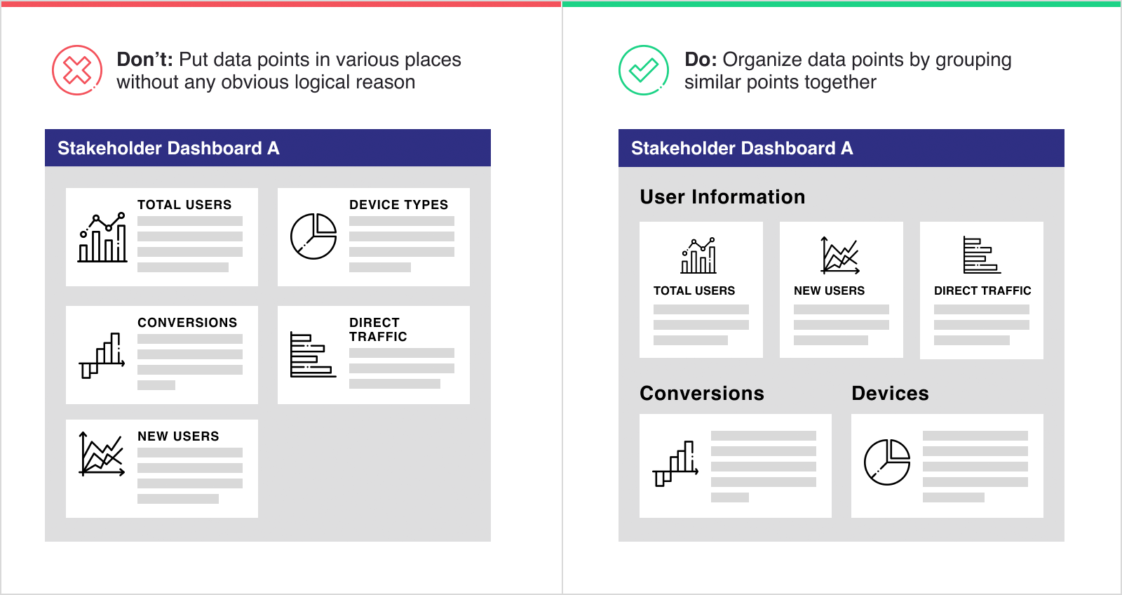
- Grouping similar data points
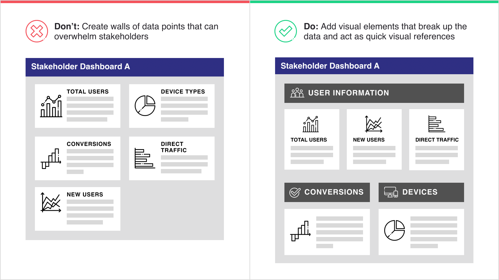
- Using visual aids other than graphs to facilitate quick understanding
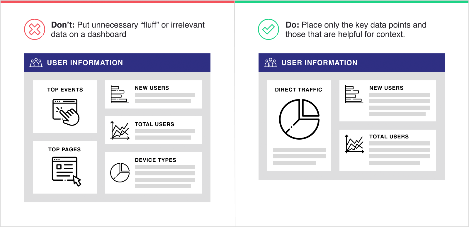
- Tailoring your dashboards to show only the key information
Use Proximity to Keep Similar Data Points Together
If a dashboard’s data points are randomly placed or jump unpredictably from one type of data to another, it can be difficult to understand what parts of the dashboard stakeholders should view to answer their questions. Without properly organized data points, stakeholders get lost in the visual back-and-forth rather than spending their time digesting the information. Similar to the practice of content chunking when writing, grouping similar or related data points based on common themes is a quick way to effectively organize a dashboard. When dashboards are organized well, they flow naturally and allow stakeholders to quickly identify what they need to look at. This flow also lets users visualize data and boosts user retention.
Don’t Let Clutter and Disarray Overpower Information
Digital analytics dashboards are fantastic sources of knowledge and insight; however, when bar charts, line graphs, and tables are immediately followed by more pie charts, scatter plots, and tables, a dashboard can start to look like nothing more than a giant wall of data. Including visual aids aside from charts, graphs, or tables can help you break up a wall of data points into meaningful sections that guide stakeholders to the specific data they need. Thoughtfully placed icons and images are a simple but effective way to make the dashboard more readable and digestible for the stakeholder. For example:
- If a cluster of data points focuses on user information, you can include an icon representing a person or people.
- If a set of data points is related to conversions, you can add a checkmark icon to signify completed actions.
Don’t Become Lax After the Initial Work is Done
When you work in an industry, such as digital analytics, that’s crazy about data points, badly maintained dashboards can quickly become lengthy and overwhelming data hubs. Rather than turning away from an intimidating dashboard, let these best practices guide you in restoring its usefulness. The habits you use to build a dashboard will also help you maintain it.
Periodically stopping to ask questions is a good way to create the checks and balances that weed out potential ‘fluff’ data.
When you create a digital analytics dashboard, ensure each data point has a purpose and provides essential information – not just nice-to-know data points. Analysts and data scientists looking to build a dashboard should consider who the dashboard is for, what the future deployment situation might be, and the problem the dashboard seeks to solve. Keeping these elements in mind can help you appropriately tailor your dashboard and maintain focus. Periodically stopping to ask questions is a good way to create the checks and balances that weed out potential ‘fluff’ data while retaining essential, original data. If a data point might be considered ‘fluff’ but might also provide helpful context or historical knowledge, then treat it like you would treat an appendix in a report: place it at the bottom of the dashboard or add it to a separate, linked page.
Don’t Let a Bad Digital Analytics Dashboard Drag You Down
When a dashboard embraces readability, it becomes a powerful tool rather than a hindrance. Instead of creating yet another data source that requires excessive time to understand and learn, a strong and readable dashboard seamlessly drives positive changes and gives quick insights into a company’s digital performance.
rafting the core of a useful digital analytics dashboard requires reliability and consistency, but if no one can understand the results, your hard work only creates more work. An effective dashboard utilizes all three of the pillars discussed in this series, but striking the right balance is easier said than done. If your dashboard is lacking in one or more of the three areas we’ve covered, reach out to BlastX Consulting to find out how we can assist or use dashboard templates to get closer to your goal.